Misc. from Thriveworks
 Make the clinicians happy, and the clients will come.
A deep-dive case-study on the clinician, client, and call center agent work I led at Thriveworks. Includes UX research, UX writing, data analysis, visual design, prototyping, usability testing, product strategy, service design and more.
View case study
BandLoveClub
Bands work hard, let’s help them get paid.
Show off the bands you 💕, give them a few 💰.
Create your free profile, rep your favorite bands, tip them anytime for their hardwork.
Available: everywhere
View prototype
MyPerfectJob
Stop hoping the perfect product job finds you
Find product people by what they want to do.
MyPerfectJob is the opposite of a job board; it’s an ideal role board. Tell companies what you want and don’t want in your perfect role.
Available: everywhere
Visit site
Productboard storytelling
Current headline + hero
New headline + hero
The headline and subcopy isn’t compelling.
In my humble opinion, the most important part of a website is the actual words used on a given page (especially the headline). So I interviewed 16 non-customers to understand their jobs, pains, and tools. I then summarized this into themes and 6 variants of value propositions, and tested this further (using message testing).
Next step: A/B testing this new messaging on the homepage. If this proves fruitful, then we’ll be rolling this out to the rest of the high-traffic pages.
SimplePractice.com Relaunch
The old website
The new website
The old website had no clear owner of it, and no focus on design, content, or conversion.
I redesigned and relaunched the site, as well as built out the web team (2 engineers, 1 SEO specialist). Conversions increased 15%, and lead-gen increased 30%.
I also componentized everything to unblock marketing efforts (new landing pages, testing homepage designs, copy, etc.).
Available: everywhere
Visit site
Systemic
A design system for your emails.
Always look great in your users inbox. Systemic is a cross-device optimized, modular email design system to plug into any app.
Available: everywhere
Visit site
Find Your Newsletter (Sold🤘)
The best newsletters on the web.
Finding great newsletters can be better. Plus, they are a great way to consume content you might not otherwise ever find.
Available: everywhere
Visit site
Saas Weekly (Sold🤘)
Curated, SaaS news delivered to your inbox.
Sign up today and get the best SaaS articles the web has to offer every Friday. Free & no spam ever.
Update: I sold this project 🤘
betalist
User testing with your actual customers.
Don’t waste anymore effort trying to recruit users for each test. And there’s no need to manage multiple lists of testers, in multiple places.
Available: everywhere
Visit site
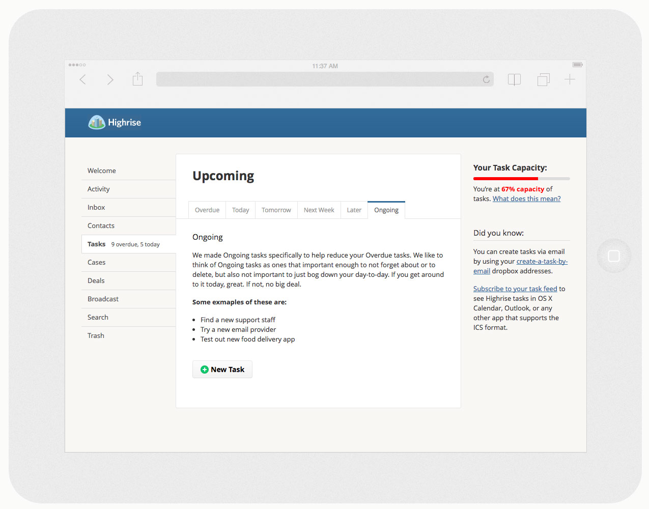
Highrise Tasks
Desktop + tablet (mobile excluded)
View Prototype
Rethink Tasks (design challenge)
The Problem
Overdue tasks are a huge point of pain for users of task systems everywhere. People love starting new task systems (Things, Asana, whatever), but once you start collecting old/overdue tasks people start throwing away/ignoring/starting over.
My Solution
Note: this was a design exercise, I put my best effort forth with all that I knew at the time. That said, at a high-level, for Overdue tasks: break out the list into groupings based on their Category. Plus, add in bulk editing of tasks, giving the user a quick way to dismiss loads of tasks that are not critical, or might be long gone. You can also bulk update (i.e. adjust due dates, assingees, etc.) loads of tasks at the same time. Any time you add bulk editing for actions, you also need to add in undo support for these as well. Supporting mistakes in UI is critical to reducing anxiety around updating tasks. Along with these new additions to the overall system, I wanted to add in a Deleted view to allow for more power user support.
I also introduced a new concept of Ongoing tasks. This type of task can cover a lot things: at it’s most basic it’s for tasks that are important for the user to eventually get done, but not priority enough to assign a due-date to it (or after it’s been languishing as Overdue). Or, they are tasks the re-occur on some basis.
Finally, I also wanted to introduce the concept of Task Capacity. This concept would help to alert the logged-in user, as well as their superiors, about their actual workload based on what is assigned to them. Having a measurable way to see their capacity feels like it could be really effective in reducing burnout or frustration, as well as for bubbling up workloads.
I was offered the job @ Highrise, but I decided to stay local. Thus, my efforts were very well received by the team. 😃
What I did
I researched, iterated, designed and built the front-end for this prototype.
View Prototype
Misc. from Tradesy
Desktop + tablet & mobile view
(animated GIF)
Self-service Overhaul
The Problem
Getting help on a website can be overwhelming, and often is an afterthought from a design standpoint. At Tradesy, we knew that our current solution (like so many others) was lacking, as well as it was actually creating a bottle neck for our Member Care Team.
Our Solution
We focussed on designing & building a solution that freed up our Member Care agents to help out our members who really had large issues, and to allow our members with small issues to get the help they needed by themselves, and thus get back to more important things in their lives.
Using Zendesk’s API, we pulled all the content onto our site to create a seamless experience for our members on tradesy.com. If a member is logged in, we can better tailor the types of suggested articles to help them, as well as if they need to contact us, we automatically pass over all the necessary data to our Member Care team without the member needing to do or provide anything else.
We also designed and built a new “short answer” concept that we are truly proud of. A member who has an issue drills down from the new Help homepage into a chosen category, and gets to a list of questions relating to their issue. Inside each question, is a summary of the question (i.e. the short answer), that should be salient enough to answer 99% of our users issues. If it’s not, then they can read the full article, or they can then contact us.
What I did
I designed and built the front-end, and integrated the API code necessary for this.
View Self-service
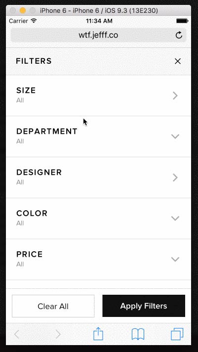
Shopping Filters Update
On mobile + tablet web
The Problem
Filtering to the right set of products on an eCommerce site is so paramount to a shoppers success, and we’ve known for a while our current filters don’t cut it. There is no way to bulk apply filters: each filter you applied reloads the page. This leads to mass user frustration, and less satisfaction with the results of using our filters. The current filters also lack large, easy tap targets, and suffer from poor UX in general (i.e. using them is confusing and unpredictable).
Our Solution
We set out to build more intuitive, and more predictable filters to help our members find what they wanted to. The result (not in production yet, but in user-testing) has proven to do just what we wanted it to—it’s allowed our users to, in a stable manner, filter down to the right set of items quicker and easier.
Along with making the filtering process itself more intuitive, we also looked at the types of filters we have, their existing usage data (to help inform ordering), and how we could improve upon the types of filters available for a given result set.
What I did
I designed and built the prototype, and ran user-testing sessions.
View Prototype
Promoted Listings
The Problem
Start-ups struggle to generate extra revene outside of their original business models. For large marketplaces, it’s common to eventually introduce ways for sellers willing to spend a bit more, to get more out of the marketplace. We felt that in 2016, given our current size, scale and traffic of daily sellers, it was the rigth time for us to do this with Promoted Listings.
Our Solution
Still in development, we’ve put a lot of thought and effort into designing an advertising system that would help all our sellers succeed. On Tradesy, we have all types of sellers: pro-sellers, power sellers, and casual sellers. We wanted to build something that all our sellers, if they chose to participate in, could find success with.
What I did
An ongoing effort that I researched and worked on initial designs / front-end builds for.
Transactional Email Standards
The Problem
Email, even in 2016, is still so important to a business. Transactional emails are often overlooked, or are considered outside the normal scope of design standards. From inconsistent type treatments, random item cards, to different footers; we needed a holistic approach to bring our email branding full circle.
Our Solution
We started by looking at our two main member flows: buying an item and selling an item. From this we were able to identify all the types of modules that could be used in a transactional. We chose to use system fonts so that we could allow the operating system to best optimize these (even in 2016 custom fonts in emails are not very well supported). We then moved all content to a single column format, to allow for easiest readability and maintenance of the templates.
These emails work and look great in all clients: Outlook, Gmail (yes, even Gmail for mobile), and everywhere in-between.
What I did
An ongoing effort that I researched and worked on initial designs / front-end builds for. I also built and tested the template for proper support in all major email clients.
View Prototype
Some mini-projects
I like to tinker; I think these are cool and add value.
Yak app
Give and get recommendations.
A friend and I were tired of not really knowing how to get good ideas of what next to read, binge watch, etc. So we decided to do something about.
Meet yak: an iOS app where you can get reviews of books, TV shows, movies and music from friends that help you find what to love next.
What I did:
Wireframes and design.
Coming soon to iOS.
Tradesy Mobile Improvements
Death to the 🍔.
Used on over 4.6 million visits since we released in August 2015. I killed the off-canvas menu, and simplified the navigation for our mobile users. The result: increased engagement, but more importantly, conversions.
I built a custom registration and login screen to do away with modal windows. These are much more stable and predictable; and lead to better form completion. For the most part, this entaled only chrome edits.
Update: I added a new view for accessing your account management, as well as a new view for in-app notifications. Tablet web is also fully supported now, as well.
What I did:
Prototyping, design, front-end build, and PHP integration.
Built for iOS, Android, and Windows platforms.
View Mobile Site
Related posts on medium.com:
Death to the 🍔 and Death to the Modals
LeagueApps Mobile Framework
📱 FTW.
Update: now serving 7-8 million uniques per month on mobile alone.
The LeagueApps platform served over 16 million views in 2014, and 8 million of them were on a mobile device. So, we optimized the templates and assets to give their mobile users the best possible experience.
I also built a custom mobile eCommerce feature which allows members to purchase product(s) associated with that program.
What I did:
User-research, user-testing, prototyping, design, front-end build, JSP integration.
Built for iOS, Android, and Windows platforms.
View Mobile Site
LeagueApps Email Templates
In 2014, we’ve sent over 2.5 million emails.
These are all automated, or notification–based emails, but they contain important information for our customers customers (i.e. the game participants). So, having them look right in all programs was uber important. And, we nailed it. These work in Outlook, Gmail, and everywhere else.
What I did:
Design, front-end build, Litmus testing.
Works in: iOS, Android, Outlook, Gmail and more
View Email Template
Dads’n’Shows
We’re DC dads that still love shows.
A homegrown meetup group I designed and built, and run on Github Pages & Mailchimp.
Available: everywhere
Visit site
Listenin’ to
We all have our favorite bands, right? But who are our favorite bands: favorite bands? Inspired by my passion for music, and the bands I love. I wanted to not only share those bands with others, but also get to know bands that inspire them, as well as bands they might be currently digging. Also built & run on Github Pages.
Available: iOS, Android, Windows, Web
Visit Listenin’ to
Littleonce app
Capture your child’s moments everyday, and share them with only who you want to. Littleonce is a simple, secure, fun daily journaling app for your child. Just take a photo, add a description to preserve the memories forever, and post it; that’s all. A Ruby on Rails app, I designed and built the UI & front-end, and did a fair amount of the Rails work, with a bit o’ help from a friend.
Available: iOS, Android, Windows, Web
Playsomethin’ app
The simple, fun way to find local sports leagues. With new members registering each day, this is the easiest way to find all the best sports leagues near you whenever you want. Powered by Scala, I designed and built the UI & front-end.
Available: iOS, Android, Windows, Web
imgRszr app
A simple way for non-tech savvy folk to resize and optimize images for use on the web. A Ruby on Rails app, I designed and built the UI & front-end, and did most of the Rails work.
Available: iOS, Android, Windows, Web
Visit imgRszr
Contentboard app
A fun, simple way for non-tech savvy folk to create, edit and share content in preparation for the web. A Ruby on Rails app, I designed and built the UI & front-end, and did all the heavy Rails work.
Available: iOS, Android, Windows, Web
tmcrnch app
Send a super short, simple email to up to 3 peeps letting them know you’re going to be late. A PHP app, I designed and built the UI & front-end, and PHP + Sendgrid integration.
Available: iOS, Android, Windows, Web
yesno app
A simple app that allows users (without registering/logging in) to vote on yes or no questions. A Ruby on Rails app, I designed and built the UI & front-end, and did all of the Rails work.
Available: iOS, Android, Windows, Web
Submitted on May 17, 2017
I am sharing a recent design challenge I was given for a possible role: update the pricing page. I had a week to complete and deliver my solution. I wanted to focus on three things: increasing conversions, adding a new price point, addressing pricing more holistically for new users.
Submitted on April 22, 2017
I am sharing a recent design challenge I was given for a possible role: design an ATM for kids. I had 3 days to complete and deliver my solution. I specifically wanted to shy away from almost any visuals, and focus solely on the concept and the story.
Mused on October 15, 2015
Continuing in our updates to mobile web traffic for Tradesy.com, along with our navigation updates, we killed modals for mobile visitors. Again, as many web sites often do, we used (& still do) modals a lot. Like A LOT. But for our mobile web visitors, it was just a very awkward, unpleasant experience.
Mused on October 15, 2015
Everyone knows that mobile traffic has surpassed desktop traffic; especially when it comes to eCommerce. In 2015, Tradesy.com’s traffic experienced the same pivotal moment in April. Our current website was built like many other websites: responsive to work across all browser widths. This also meant that, like many other sites, we had a 🍔 menu. There have been many studies done on whether the hamburger menu works or not, but internally, we knew the hamburger was a bad solution to a complicated problem.
Mused on February 18, 2015
The title kinda says it all: Don't lose focus. Either of what you want your users to do on your site, but more specifically, don't lose the oft forgotten pseudo styling for interactions. CSS resets are great, but often times you'll reset default browser styling that, unless properly redefined, is critical to helping your users when interacting with any type of website.
Mused on February 16, 2015
We designers are trying our damndest to kill the web. And we've been doing it since web design became a thing. Think about this: the responsive web is something we had to make because we broke it. The web, in its very own nature is responsive.
Mused on March 21, 2014
Mused on March 20, 2014
Consider this: splash screens pervade almost all native apps. And this is seen as a good thing. But splash screens in web apps; a terrible, bad thing. Why do we allow one but not the other?
Mused on March 11, 2014
Seriously, fuck ’em. They have no place in professional design, and definitely not in web design. Why would they? They pay no attention to the specifics of the project at hand, nor those affected by said project.
Mused on June 14, 2013
By using a few simple CSS tricks, we can replace any HTML character we want by targeting it’s Unicode value.
Mused on June 13, 2013
Designers! Developers! Listen, listen! We must stop our collective nonsense. We’re putting our likes ahead of user needs, and letting our preferences cloud our products. Using antialiased text (albeit limited to webkit, possibly blink, browsers) is a bad, poor, erroneous choice.
Mused on June 12, 2013
We've been doing it wrong since the beginning. And no, I'm not referring to life in general, though the argument could be made for that. I'm more referring to what we deliver to clients in the design phase, and what they end up getting in the prototyping / development / deliverable phases.
Mused on April 29, 2013
Developers everywhere fear older versions of IE, its's a fact, and it's a fact for good reason. Supporting IE 8, 7 and possibly even 6 makes building the web unfun. But, for some business verticals and clients, it's a necessity, as for some of them, their users still traverse the web with these older, archaic browsers. And, there is not much we can do about this, outside of a few hacky-type things.
Mused on March 16, 2013
Somewhere recently I’ve noticed a disturbing trend: services like Spotify, Rdio and the like, are not as wonderful for the artist as the public assumes. At least, a trend in as much as the information has been presented in these articles. First, a disclaimer—I use, and have used Spotify for as long as it’s been available in the US.
Mused on March 07, 2013
I'm probably weird, but I want no images. Not only for page speed reasons, or for retina/non-retina reasons; but for the simple fact that getting images right is very hard. And, unfortunately, very often we get them wrong.
Mused on February 27, 2013
Yep, it is hard. It's not just I don't like green. Or it's not just that looks cheap. And it's definitely not ’It needs to pop more’. It takes practice, of a sort. It takes practice after you build a solid foundation of understanding design principles. It's just like any other profession; we should not jump to conclusions about something we don't really understand.
Mused on February 25, 2013
While working on a recent project, I (re-)discovered the issue of client misunderstandings and perceptions of browsers and rendering. While a lot of people have talked about this, and tweeted about it, and mentioned that this is part of what we do, it's not where it needs to be yet. I don't know what the actual solution is to bridging the gap, but I'll run through some scenarios and how I might handle them.
Mused on February 20, 2013
Everyone knows responsive web design (henceforth RWD). Well, people in the web industry, and those working closely with web folk; they pretty much all know what that term implies. And they all probably have their own opinions about whether it's good or bad, or at least going in the right direction. But what about responsive email design?
Mused on February 19, 2013
I recently updated my site to use Jekyll, markdown, and Unicode icons. There are, of course, still some images, but only as necessary. Portfolio samples and 4 header images to give the site some character. However, I decided to dump a lot of tiny details in buttons and whatnot in favor of just focussing on content, and speed. The images I do use are pretty well optimized, but being that they are portfolio pieces, there's only so small I was willing to go.
Mused on February 12, 2013
Email is not dead. Email is not wrong. Email is not broken. Is it awesome to use all the time? No, of course not. But, as a medium, it is fine that is suiting it's purpose fairly well.
Mused on February 11, 2013
This is something I don't do often enough for sure. Some of this is laziness, but some of it is just budget constraint. But this is one of the most important parts of creating success; whether you're building a new product or working on a client project.

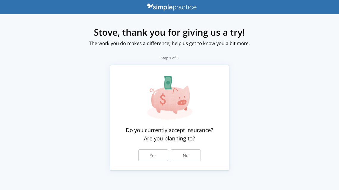 Welcome the customer, get to know them briefly.
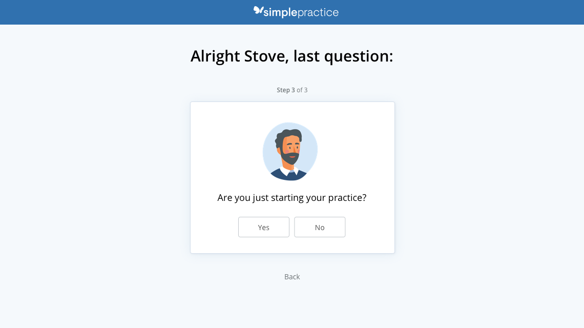 Figure out what their high-level needs, Jobs-to-be-done, are.
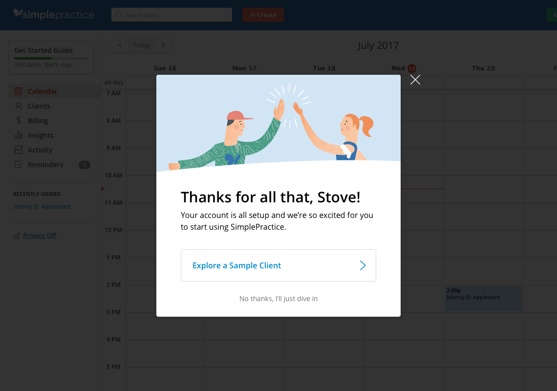 Congratulate them for making it this far.
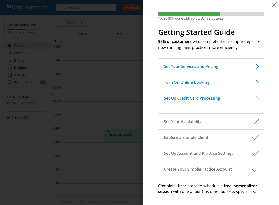 Use progress indicators to keep them hooked and engaged.